Today, We want to share with you BOOTSTRAP ACCORDION WITH PLUS MINUS ICON EXAMPLES.In this post we will show you Simple Bootstrap accordion collapse anim id with toggle button accordian, hear for Bootstrap expand / collapse with plus and minus we will give you bootstrap dropdown demo using get element by class and javascript toggle example for implement.In this post, we will learn about add plus minus symbol to a bootstrap accordion with html target attribute an example.
BOOTSTRAP ACCORDION WITH PLUS MINUS ICON EXAMPLES
There are the Following The simple About BOOTSTRAP ACCORDION WITH PLUS MINUS ICON EXAMPLES Full Information With Example and source code.
As I will cover this Post with live Working example to develop bootstrap 4 accordion with plus minus icon, so the add plus minus symbol to a bootstrap data-toggle panel accordion for this example is following below solution for bootstrap collapse not working.
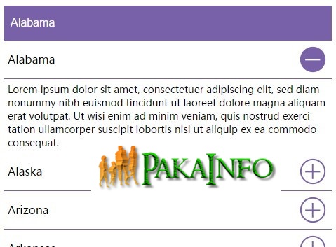
Example 1: Bootstrap expand / collapse with plus and minus
Step 1 : HTML Part with accordion table
Step 2 : javascript Part with accordion folders target
$(function() {
  function toggleIcon(e) {
      $(e.target)
          .prev('.panel-heading')
          .find(".plus-minus")
          .toggleClass('glyphicon-plus glyphicon-minus');
  }
  $('.panel-group').on('hidden.bs.collapse', toggleIcon);
  $('.panel-group').on('shown.bs.collapse', toggleIcon);

});
Full Example of the Expand Collapse Div Plus Minus Using jQuery
Example 2: jQuery Accordion with Plus and Minus Toggle
Step 1: HTML Part demo with expand collapse icons
First Accordian Head+Second Accordian Head+Third Accordian Head+First Accordian Head+Second Accordian Head+Third Accordian Head+
Step 2: jQuery Part & collapse icon with accordion card
$(document).ready(function() {
  //toggle the component with class accordion_body
  $(".accordion_head").click(function() {
    if ($('.accordion_body').is(':visible')) {
      $(".accordion_body").slideUp(300);
      $(".plusminus").text('+');
    }
    if ($(this).next(".accordion_body").is(':visible')) {
      $(this).next(".accordion_body").slideUp(300);
      $(this).children(".plusminus").text('+');
    } else {
      $(this).next(".accordion_body").slideDown(300);
      $(this).children(".plusminus").text('-');
    }
  });
});
Step 3: CSS Part
.accordion_container {
  width: 500px;
}

.accordion_head {
  background-color: skyblue;
  color: white;
  cursor: pointer;
  font-family: arial;
  font-size: 14px;
  margin: 0 0 1px 0;
  padding: 7px 11px;
  font-weight: bold;
}

.accordion_body {
  background: lightgray;
}

.accordion_body p {
  padding: 18px 5px;
  margin: 0px;
}

.plusminus {
  float: right;
}
Angular 6 CRUD Operations Application Tutorials
Read :
Summary
You can also read about AngularJS, ASP.NET, VueJs, PHP.
I hope you get an idea about BOOTSTRAP ACCORDION WITH PLUS MINUS ICON EXAMPLES.
I would like to have feedback on my Pakainfo.com blog.
Your valuable feedback, question, or comments about this article are always welcome.
If you enjoyed and liked this post, don’t forget to share.